Understand
Audit the Console, map first-time journeys, and study comparable cloud products.
Most recent internship · Cloud infrastructure
Crusoe provides the computing power that AI teams need to build and run products. I worked on the Console, the web app where customers create resources, monitor them, and understand what they cost. This case study covers three projects: first-time guidance, a usability review, and a clearer connection between usage and billing.
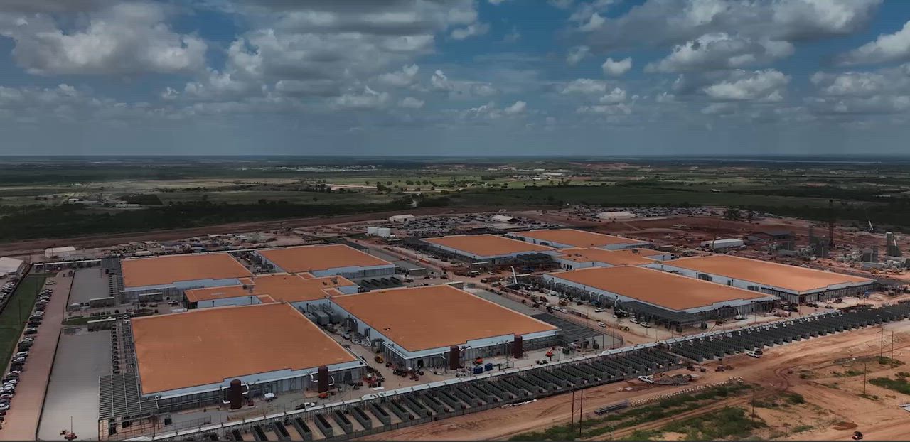
Selected internship work is presented at an appropriate level of detail.
Each initiative moved at a different pace, but the underlying process stayed consistent: understand the system, frame the right problem, design at multiple horizons, and align the final direction with the people building it.
Audit the Console, map first-time journeys, and study comparable cloud products.
Connect recurring friction to user needs, technical constraints, and product priorities.
Explore interaction patterns, test near-term and future directions, and refine the system in critique.
Partner with engineering, product, brand, and writing to prepare implementation-ready work.
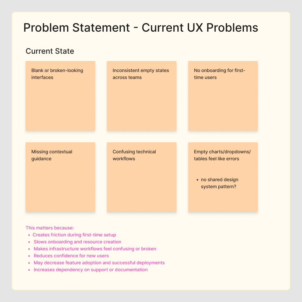
An empty state is what someone sees before they create a resource or receive data. These screens were inconsistent across the Console, so I audited the product and designed one reusable pattern. The first version was simple enough to ship quickly, with a second version showing how guidance could become more helpful over time.
I reviewed twelve screens and interface patterns, then followed a new account through five product areas. This showed where first-time users repeatedly lost context or reached a dead end.
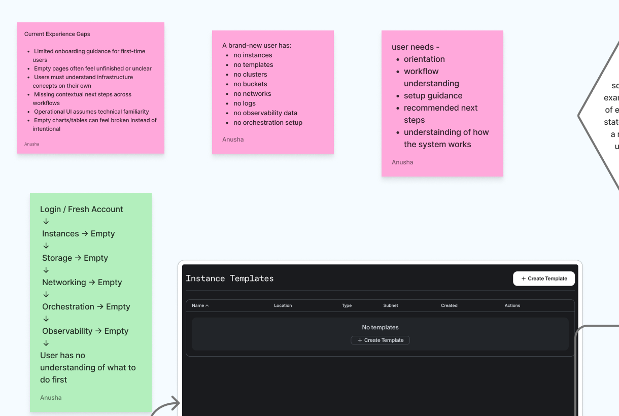
Some empty pages explained the product. Others assumed users already understood the infrastructure.
Users could start an action without knowing what they needed first or what would happen next.
Empty, blocked, loading, error, and recovery moments often used the same message.
These are six real screens from the audit. Some offered only a create button, some relied on technical language, and others revealed missing requirements only after the user tried to continue.
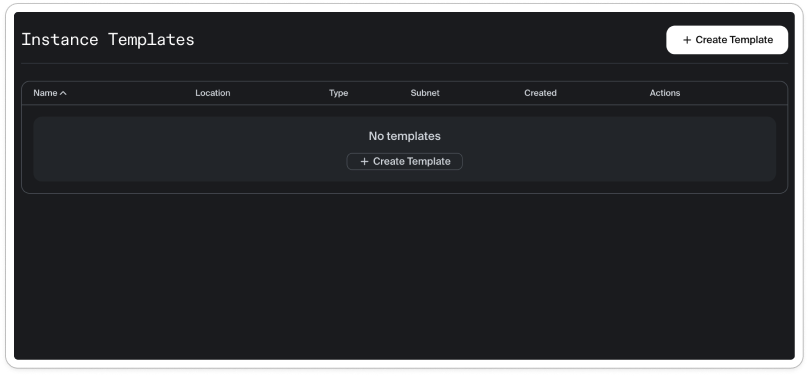
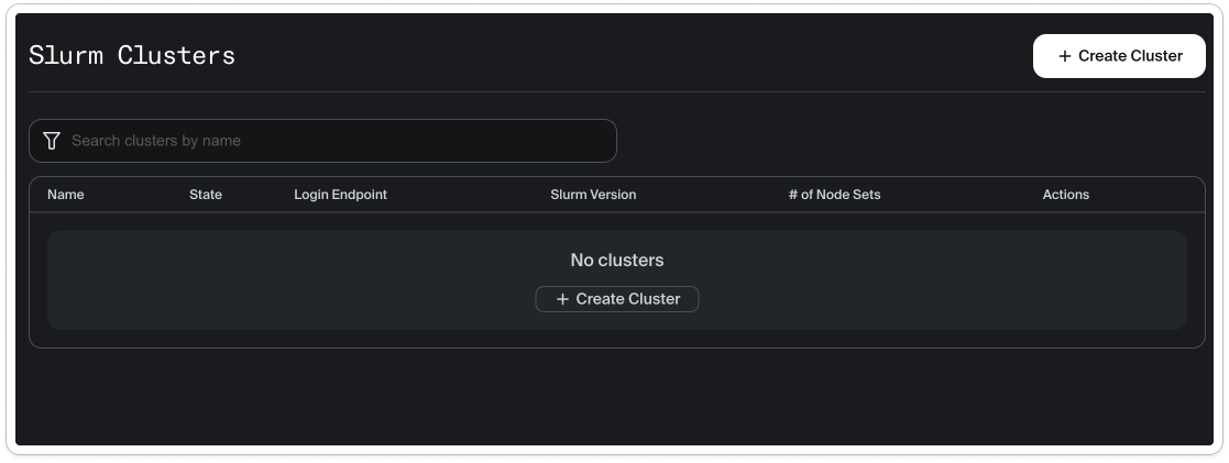
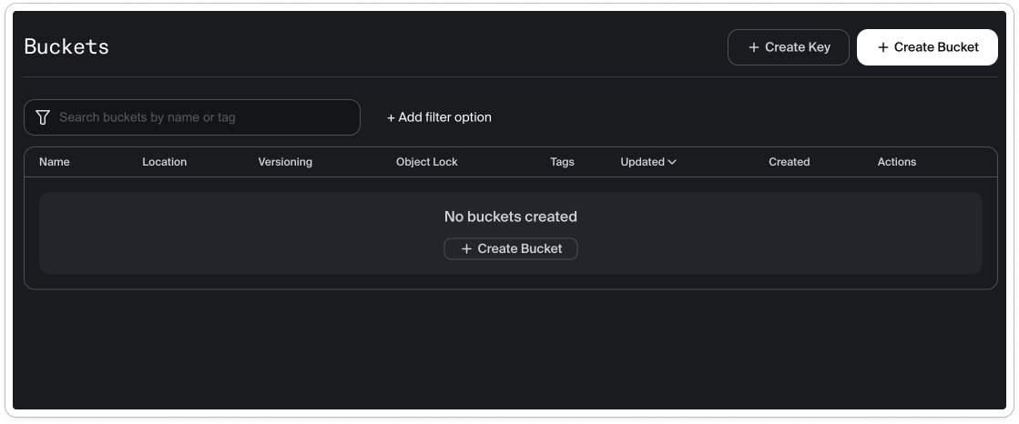
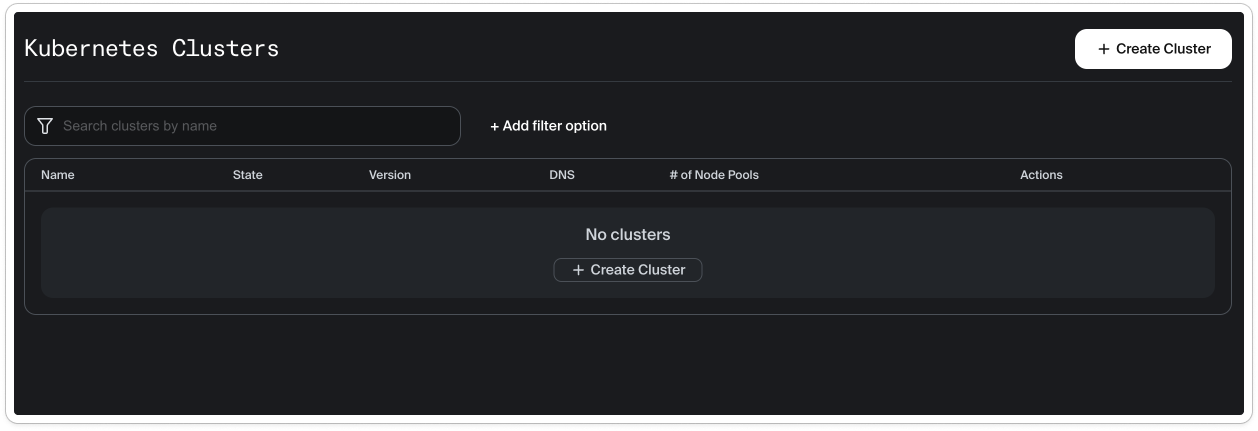
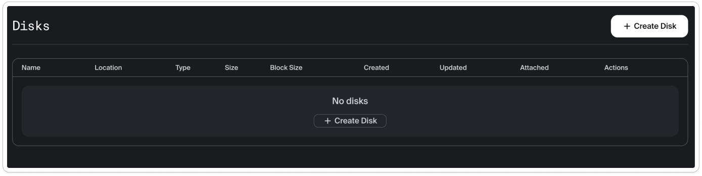
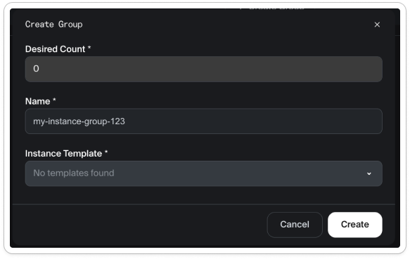
Users received different amounts of context depending on where they entered the Console.
Create buttons appeared before prerequisites, expected outcomes, or useful starting choices were clear.
Truly empty, blocked, and missing-prerequisite moments were not clearly distinguished.
The goal became clear: explain what the product does, recommend one next step, and keep users informed after they start an action.
Users could tell that nothing existed, but not what the resource did, why they needed it, or what to create first.
First-time users needed enough context to begin without reading a wall of technical instructions.
The guidance covers setup requirements, creation in progress, failure, recovery, and the next step after success.
I compared how similar products explain resources, recommend a first setup, place documentation, and show progress or errors. I used the clearest patterns as principles, not as screens to copy.
How other cloud tools introduce an unfamiliar resource.
Use a specific title and one short explanation instead of a generic “no data” message.
Whether users see only a create button or receive a useful starting point.
Lead with one action now; add recommended setups in a later release.
Where other products place documentation, command-line steps, and prerequisites.
Keep documentation visible and explain requirements before users reach a dead end.
How the interface responds after a user starts an action.
Use banners to show progress, failure, retry, and readiness after creation begins.
The clearest products explained the resource in plain language, recommended one starting path, and showed visible feedback after the user acted.
Every empty state received the same basic structure: a relevant illustration, a clear title, a short explanation, one primary action, and a link to documentation.
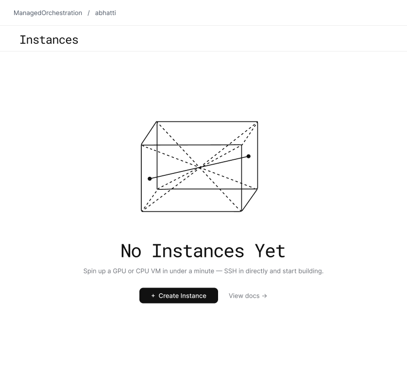
Name the specific resource or data instead of using a generic “nothing here” message.
Give users only the context they need to understand the screen and the next step.
Make the best next step obvious and keep documentation available as a secondary option.
Design for requirements, progress, failure, and recovery instead of stopping at the first empty screen.
Recommended setup cards help users make the first choice. Persistent banners then explain what is happening, what went wrong, or what to do next. Keeping this work separate allowed the simpler first release to move forward.
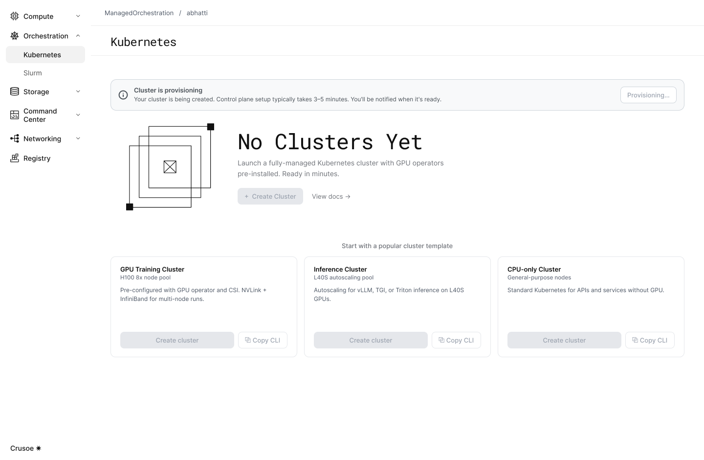
The cards recommend where to start. The banners explain progress, failure, recovery, and readiness.




I reviewed the work early with design, product, engineering, brand, and technical writing. Together, we chose a focused first release and made each part easier to build and reuse.
Design and product helped separate a focused first release from ideas that needed more time.
Engineering confirmed which states, actions, and requirements the Console could support.
Brand and technical writing refined the illustrations, terms, instructions, and help links.
I used AI to group repeated observations, compare wording options, and look for missing states. I checked every result against the original research, and the team made the final decisions about accuracy, feasibility, and tone.
We shipped a simple, consistent first version and saved the more advanced guidance as a clearly documented next step.
The team received a first version ready to build and a clearly documented plan for a more guided second version.
Give users enough context to act, without making an empty moment feel heavy.
I worked with design, product, engineering, brand, and technical writing throughout the internship. We reviewed problems early, agreed on scope, refined the experience together, and documented decisions before handoff.
The internship produced improvements the team could ship now, reusable patterns for future work, and clear documentation for larger ideas that needed more time.
Created one empty-state system for the Console, with a focused first release and a clear next version.
Connected AI usage, cost, the responsible product, and the system activity behind it.
Turned usability findings into Jira tickets ranked by user impact and engineering effort.
Delivered final designs, edge cases, behavior notes, and implementation guidance.
06 · Reflection
Infrastructure products feel easier when users can always see what they selected, what the system is doing, and what will happen next.
A strong first release can solve the immediate problem while still leaving a clear path for a more ambitious version.
Design documentation should help the team understand the decision, not only show the final screen.