Case Study
FlowOps
Designing an enterprise request management system
End-to-end product design focused on workflows, roles, and decision clarity in enterprise tools.
Role
Product Designer
Timeline
2 weeks
Tools
Figma, Adobe Creative Suite
Deliverable
Hi-Fi Prototype
Enterprise Request Management
01
Problem & Context
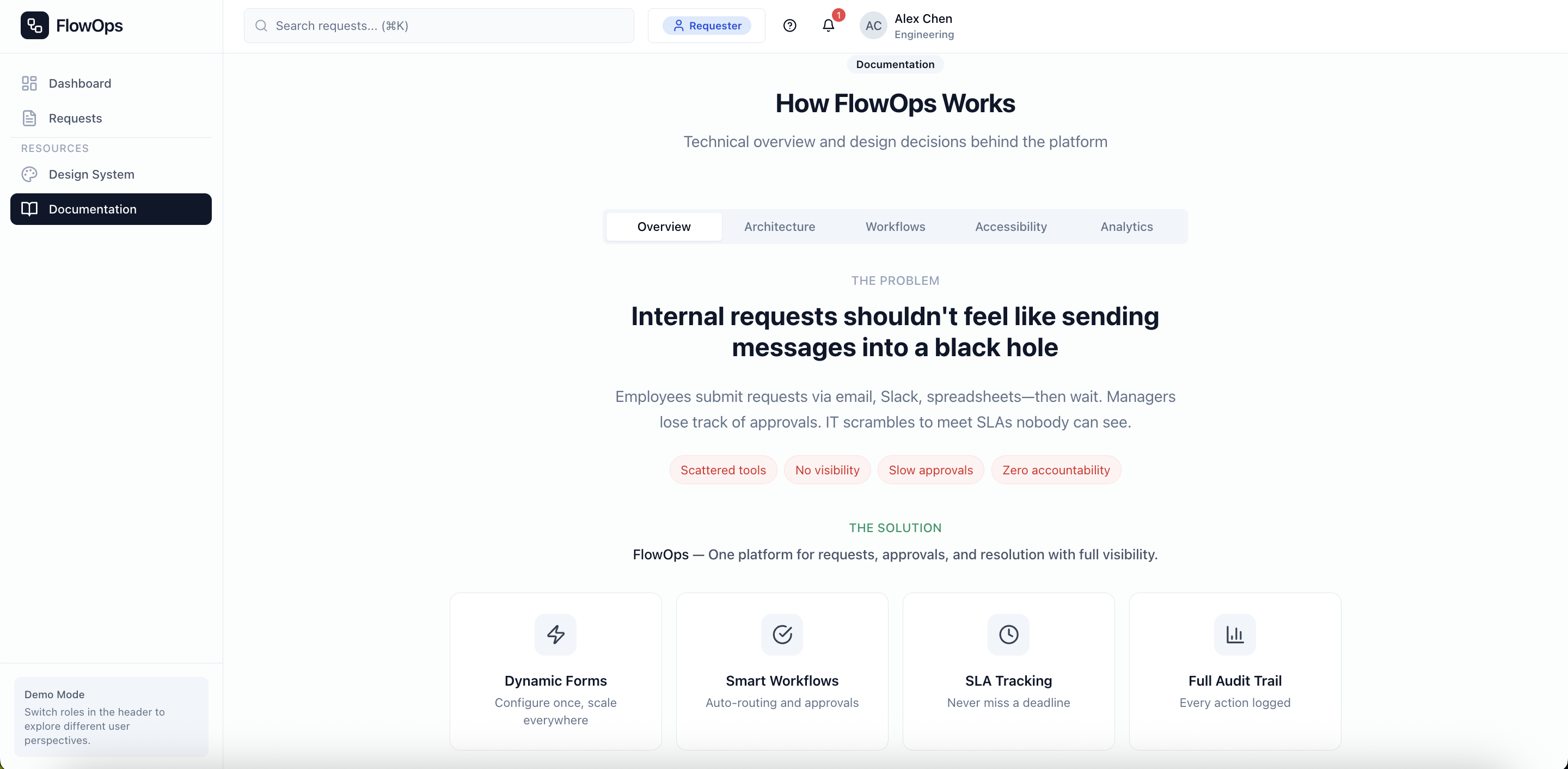
Internal requests get lost. Approvals stall. Nobody knows who owns what.
The Pain
Requests submitted via email, Slack, and spreadsheets. No single source of truth. Approvals buried in inboxes.
Who Suffers
Employees waiting weeks for equipment. Managers drowning in approval requests. IT teams triaging without context.
Why It's Hard
Multiple roles with conflicting needs. Compliance requirements. SLA contracts with real penalties. Scale across departments.
Design Challenge
How might we design a system where request ownership is always clear, approvals never stall invisibly, and every user sees exactly what they need to do their job, without drowning in stuff they don't?
02
Goals & Success Criteria
Before jumping into screens, I mapped out what success actually looks like (and what I intentionally left out of scope).
Design Goals
Eliminate ambiguity around request ownership and status
Support 4 distinct user roles without duplicating workflows
Make high-volume request triage fast and reliable
Surface SLA deadlines and bottlenecks before they become crises
Deliberately Out of Scope
Integrations with external ticketing systems
Custom workflow builder for admins
Multi-language/internationalization
Mobile-native experience (responsive web only)
Why scope matters: By keeping the scope tight, I could really dig into the core problem (request clarity and role-based workflows) instead of building a shallow version of everything.
03
Users & Roles
Enterprise systems fail when they treat all users the same. I designed for four distinct roles with different goals, different constraints, and sometimes conflicting needs.
Requester
Employee
Goal
Get their request resolved quickly with minimal friction
Constraint
Limited visibility into process; doesn't know who to escalate to
Conflict
Wants speed; system needs completeness for triage
Approver
Manager
Goal
Make informed decisions fast; avoid becoming a bottleneck
Constraint
High volume; limited time; needs context at a glance
Conflict
Requesters want quick approval; compliance needs thorough review
Agent
IT/Operations
Goal
Efficiently triage and resolve requests within SLA
Constraint
Handles many requests; needs to prioritize by urgency and SLA
Conflict
SLA pressure vs. thoroughness; internal notes vs. transparency
Admin
Operations Lead
Goal
Configure system to match org needs; ensure compliance
Constraint
Must balance flexibility with simplicity for end users
Conflict
Power-user needs vs. keeping UI simple for others
Affinity Mapping
Synthesizing Research Insights
I mapped user pain points and requirements to identify patterns across four key themes:
Request Clarity: Users need to know exactly where their request stands and who's responsible.
Role Separation: Different users need different views. One size definitely doesn't fit all.
SLA Visibility: Urgency must be visible without requiring manual checks.
Request Clarity
User Behavior
Submits request then constantly asks "any update?" via Slack.
Needs / Goals
Self-service status tracking without bothering anyone.
Pain Point
Status updates buried in email threads, easy to miss.
Opportunity
Real-time status dashboard with clear ownership indicators.
Role Separation
User Behavior
Managers approve via email, losing context and history.
Needs / Goals
Quick decisions with full context, not hunting for details.
Pain Point
Same interface for all roles means irrelevant clutter.
Opportunity
Role-specific dashboards showing only what matters.
SLA Visibility
User Behavior
SLA breaches discovered only when customer complains.
Needs / Goals
Proactive alerts before deadlines become crises.
Pain Point
No visibility into which requests are at risk.
Opportunity
Color-coded SLA badges on every request surface.
Key Insight
The research revealed a core tension: requesters want speed, approvers want context, agents want efficiency, and admins want control. A single universal interface would fail all of them. This shaped the decision to build role-specific experiences from the start.
User Flows
Core journeys mapped from research insights
Requester: Submit & Track
Approver: Review & Decide
Agent: Triage & Resolve
Admin: Configure System
Low Fidelity Designs
Early Explorations
I started with rough sketches to explore layouts for the key screens: request dashboard, detail view, triage queue, and approval workflow. These wireframes helped establish information hierarchy before committing to visual design.
These rough sketches helped establish the core layout patterns: sidebar navigation, data tables for list views, modal dialogs for actions, and prominent SLA indicators. Quick iterations let me test information hierarchy before investing in visual polish.
04
Information Architecture
The core design challenge was figuring out how to organize complex data hierarchies so each user sees exactly what they need. Nothing more, nothing less.
Role-Adaptive Navigation
Requester
My Requests → New Request → Drafts
Approver
Pending Approvals → Team Requests → SLA Dashboard
Agent
Triage Queue → My Assignments → All Requests
Admin
Configuration → SLA Policies → User Management → Audit Log
Request Detail Hierarchy
Identity & Status
Ticket ID, title, current state, SLA indicator
Context & Actions
Available transitions, primary CTA based on role
Details & History
Form data, timeline, comments, internal notes
Metadata & Audit
Timestamps, actors, field-level change history
Design Decision: Instead of one massive interface showing everything, I designed contextual views that surface relevant info based on what the user is actually trying to do. This reduces cognitive load while still giving access to full details when needed.
05
Key Workflows
I mapped four critical end-to-end flows to understand where users struggle and where the system needs to provide clarity.
Create → Approve → Resolve (Happy Path)
Design focus: Clear status indicators at each stage so requester always knows where their request stands.
Agent Triage & Assignment
Design focus: Triage scoring surfaces highest-priority items automatically; bulk actions for efficiency.
"Needs Info" Loop
Design focus: Prevent requests from stalling invisibly; clear prompts for what info is needed.
SLA At-Risk Escalation
Design focus: Visual escalation before breach; dashboard surfaces at-risk items without manual checks.
06
Interaction & UX Decisions
Every UI choice had a reason behind it. Here's how I thought through the major interaction decisions, focusing on decision clarity over pixel perfection.
Decision
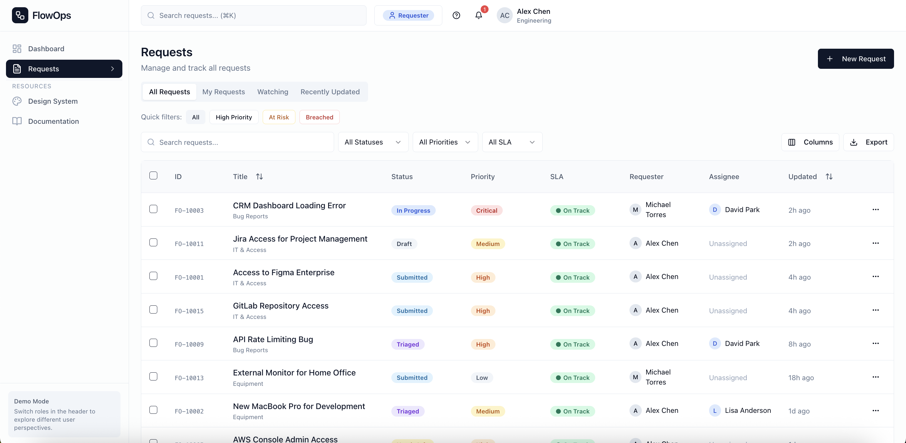
Tables over cards
Why
Agents process 50+ requests a day. Tables let them sort, filter, and bulk-select, which is critical for high-volume triage. Cards look prettier but hide data density. For productivity, tables win every time.
Decision
SLA badges on every surface
Why
SLA breaches cost money. Users shouldn't have to click into a request to know it's urgent. Green/amber/red badges on lists, details, and dashboards make urgency impossible to miss.
Decision
Modals for actions, not pages
Why
Approvers review requests one after another. Navigating to a new page breaks their flow. Modals keep the request visible while they make their call: approve, reject, or ask for more info.
Decision
Required rejection reasons
Why
A flat "Rejected" with no explanation frustrates requesters and leads to repeat submissions. Making reasons mandatory adds friction for approvers, but that's intentional. It encourages them to actually think before hitting reject.
Decision
Role-specific navigation
Why
A universal dashboard sounds flexible but creates confusion. Requesters don't need triage queues; agents don't need draft management. Each role sees only what's relevant to their job.
Error States, Empty States, Confirmations
Empty States
Not just "no data" but includes a clear next action ("Create your first request")
Error States
Specific error messages with recovery paths, not generic "Something went wrong"
Confirmations
Toast notifications for actions; clear feedback without blocking flow
07
Accessibility & Edge Cases
This section doesn't get enough love, but it signals real design maturity. Enterprise software serves diverse users in all kinds of contexts.
Accessibility
Color independence
Status badges use icons + text labels, never color alone
Keyboard navigation
Full keyboard support with visible focus states; ⌘K command palette
Screen reader support
ARIA labels, live regions for status changes
WCAG AA contrast
All text and interactive elements meet contrast requirements
Edge Cases
Permission boundaries
Graceful handling when users attempt actions outside their role
Concurrent edits
Warnings when data has changed since page load
SLA edge cases
Blocked time excluded, business hours respected, timezone handling
Permission-based visibility
Internal notes hidden from requesters; admin tools hidden from agents
08
Validation & Iteration
Design isn't about nailing it on the first try. It's about learning and improving as you go. Here's what I discovered through walkthroughs and iteration.
What I Tested
Walkthrough with product managers
Validated workflow complexity and approval logic made sense to stakeholders
Self-testing role flows
Switched between roles to ensure each experience was coherent end-to-end
What Caused Confusion
Initial design had too many status options
Consolidated from 12 states to 8 after feedback that "Pending Review" and "Awaiting Approval" felt redundant
SLA badges weren't prominent enough
Increased badge size and added to list views after agents missed at-risk items in initial design
What I Changed
Added bulk actions to agent queue
Originally single-select only; bulk assign/close reduces repetitive clicks
Made rejection reasons mandatory
Was optional; made required after seeing requesters frustrated by unexplained rejections
09
Outcomes & Metrics
Product designers think in outcomes. While this is a concept project, I defined expected success metrics to validate the design direction.
↓
Time to triage
Priority scoring surfaces urgent items instantly
↓
Stalled approvals
"Needs Info" state prevents invisible blocking
↑
SLA visibility
At-risk items surface before breach
↑
Accountability
Every action logged; ownership always clear
Note: These are projected outcomes based on the design's intent. In a production context, I would measure actual time-to-resolution, SLA breach rates, and user satisfaction scores.
10
Reflection & What's Next
Every project teaches something. Here's what I'm taking forward.
What I Learned
- Designing for competing user needs is harder than designing for one persona
- "Flexible" often just means "confusing." Constraints can actually improve UX
- Enterprise users value speed and clarity over visual polish
What I'd Improve
- User testing with actual IT operations teams
- Reporting dashboard for SLA trends over time
- Mobile-responsive agent views for field technicians
How This Changed My Approach
- I now map user roles and conflicts before any wireframes
- I design for edge cases early, not as an afterthought
- I document decisions, not just screens
Key takeaway: Enterprise software succeeds when it handles complexity invisibly. The goal isn't to strip out features. It's to show the right features to the right user at the right time. FlowOps taught me that product design at scale is really about systems, not just screens.
11
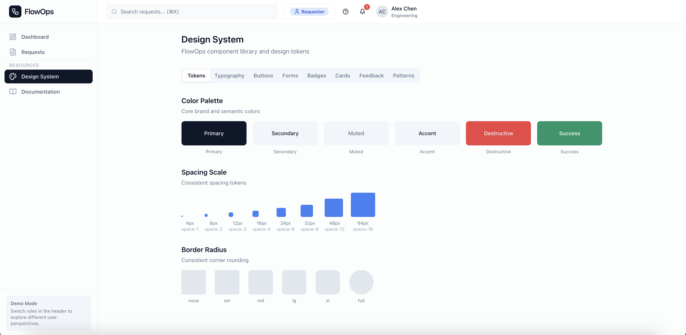
Design System
A scalable component library ensuring consistency across all screens and user roles.
Color Palette
Primary
#EF4444
Success
#22C55E
Warning
#F59E0B
Info
#3B82F6
Typography
Heading 1
24px / Bold
Heading 2
18px / Semibold
Body Text
14px / Regular
Caption
12px / Regular
Components
Buttons
Status Badges
Input
Status Badge System
Request Status
SLA Indicators
12
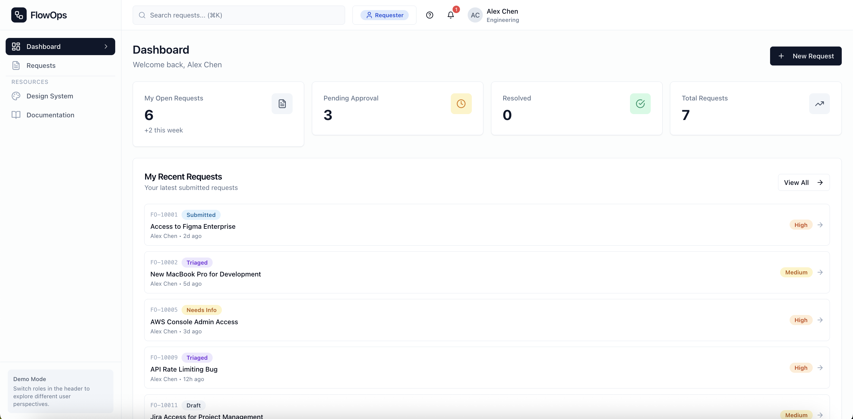
Final Product
The complete FlowOps design, from dashboard to detail views. This showcases all the role-specific experiences and the full request lifecycle.
Request Dashboard