Case Study
NeuraNote
A learning system disguised as a note-taking app.
Role
UX Designer & Researcher
Duration
6 weeks
Tools
Figma, Adobe Creative Suite
Platform
Web Application
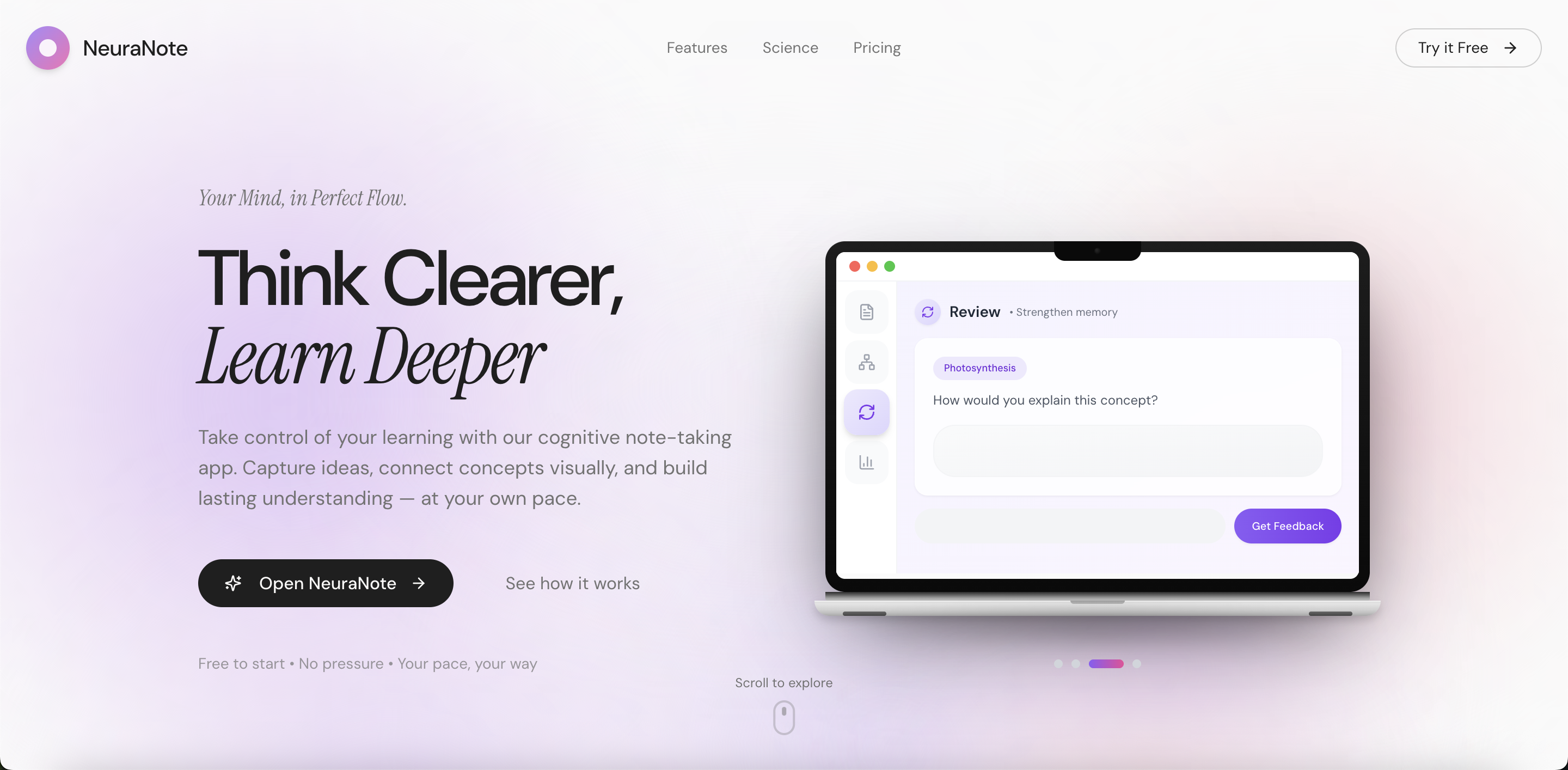
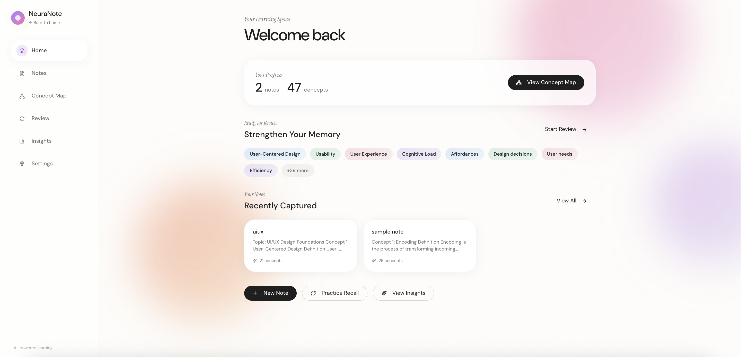
Landing Page
01
Overview
Most note-taking apps help you organize. NeuraNote helps you actually learn.
I designed NeuraNote around cognitive science principles (retrieval practice, spaced repetition, and concept mapping) to transform passive notes into active learning. The goal: help students build lasting understanding, not just forgotten files.
Problem Statement
How might I design a note-taking experience that helps learners capture, connect, and review ideas in a way that supports deep understanding and long-term memory rather than passive information storage?
02
Design Process
June 2025 to July 2025
03
Research
Research Goals
I started with a hypothesis: existing note-taking tools prioritize speed and organization over actual learning. I wanted to understand how students currently study, where they struggle, and what prevents knowledge from sticking, then design something that supports deep understanding and long-term retention without adding pressure.
User Surveys
Survey sample: n = 28 users
Devices Used for Note-Taking
This informed a web-first experience optimized for longer writing sessions.
Primary Note-Taking Applications
This highlighted an opportunity to design beyond organization toward learning-focused workflows.
Note-Taking Purpose
55% of users take notes primarily for school.
Key Takeaways
General-purpose tools dominate. 72% use laptops, and over half rely on Google Docs (built for documents, not learning). This revealed an opportunity to design for how students think, not just type.
School is the primary use case. 55% take notes for academics, so I focused on comprehension and retention features rather than workplace collaboration.
Capture ≠ retention. Users consistently reported that despite detailed notes, they couldn't recall information when needed. This gap became my core design challenge.
Competitive Analysis
Evaluating existing note-taking tools
Notion
Productivity
Structure over retention
GoodNotes
Handwriting
No concept linking
Apple Notes
Quick capture
Static after capture
Google Docs
Collaboration
Not built for learning
NeuraNote
Learning-first
NeuraNote closes this gap
A clear pattern emerged: existing tools excel at either capture or organization, but none prioritize learning. Spaced repetition, concept linking, and metacognitive prompts are absent across the board.
This validated my hypothesis: there's room for a tool that bridges note-taking and understanding, treating notes as the starting point for deeper learning.
Affinity Mapping
Synthesizing Research Insights
I synthesized survey and interview data through affinity mapping. Three themes emerged:
Organization: Quick access to notes and cross-subject connections without complex folder structures.
Collaboration: Easy sharing for study groups and team knowledge transfer.
Efficiency: Fast capture during lectures, effective review for retention.
Collaboration
User Behavior
Takes shared notes during study groups or review sessions to align understanding and divide work.
Needs / Goals
Wants collaborators to see how ideas are connected, not just shared text blocks.
Pain Point
Collaborative notes become cluttered and difficult to review after the session ends.
Pain Point
No clear ownership or visibility into who added or edited specific concepts.
UX Principle
Collaboration should reduce cognitive load, not add coordination overhead.
Opportunity
Shared concept maps that visually represent relationships and show contributor ownership.
Organization
User Behavior
Takes notes across multiple subjects and courses within the same app.
Needs / Goals
Wants notes grouped by conceptual meaning rather than folders or file location.
Pain Point
Hard to see relationships between topics when notes are separated by notebooks or files.
Pain Point
Over-organizing notes interrupts learning flow and attention during capture.
UX Principle
Organization should support sense-making, not just storage.
Opportunity
Auto-generated concept clusters and visual maps that organize notes based on meaning.
Efficiency / Speed
User Behavior
Takes notes quickly during lectures to keep up with fast-paced information.
Needs / Goals
Wants to capture ideas without breaking focus or attention during learning.
Pain Point
Reviewing long, unstructured notes is time-consuming and inefficient.
Pain Point
Passive rereading of notes feels ineffective for long-term retention.
UX Principle
Speed should not sacrifice learning depth or understanding.
Opportunity
One-click conversion from notes to recall-based formats like flashcards or prompts.
Key Insight
A clear tension emerged from the research: users prioritize speed when capturing notes, but that same speed undermines retention. Information accumulates, connections fade, and reviewing feels like a burden rather than a benefit.
This insight shaped the core design direction: automate the organization layer. Instead of asking users to manually tag and categorize, NeuraNote intelligently surfaces relationships between concepts, transforming scattered notes into interconnected knowledge.
Low Fidelity Designs
Early Explorations
I sketched initial concepts focusing on three journeys: note creation, concept visualization, and review for retention. Each sketch was evaluated against research findings to ensure I was solving real problems.
User Flow Explorations
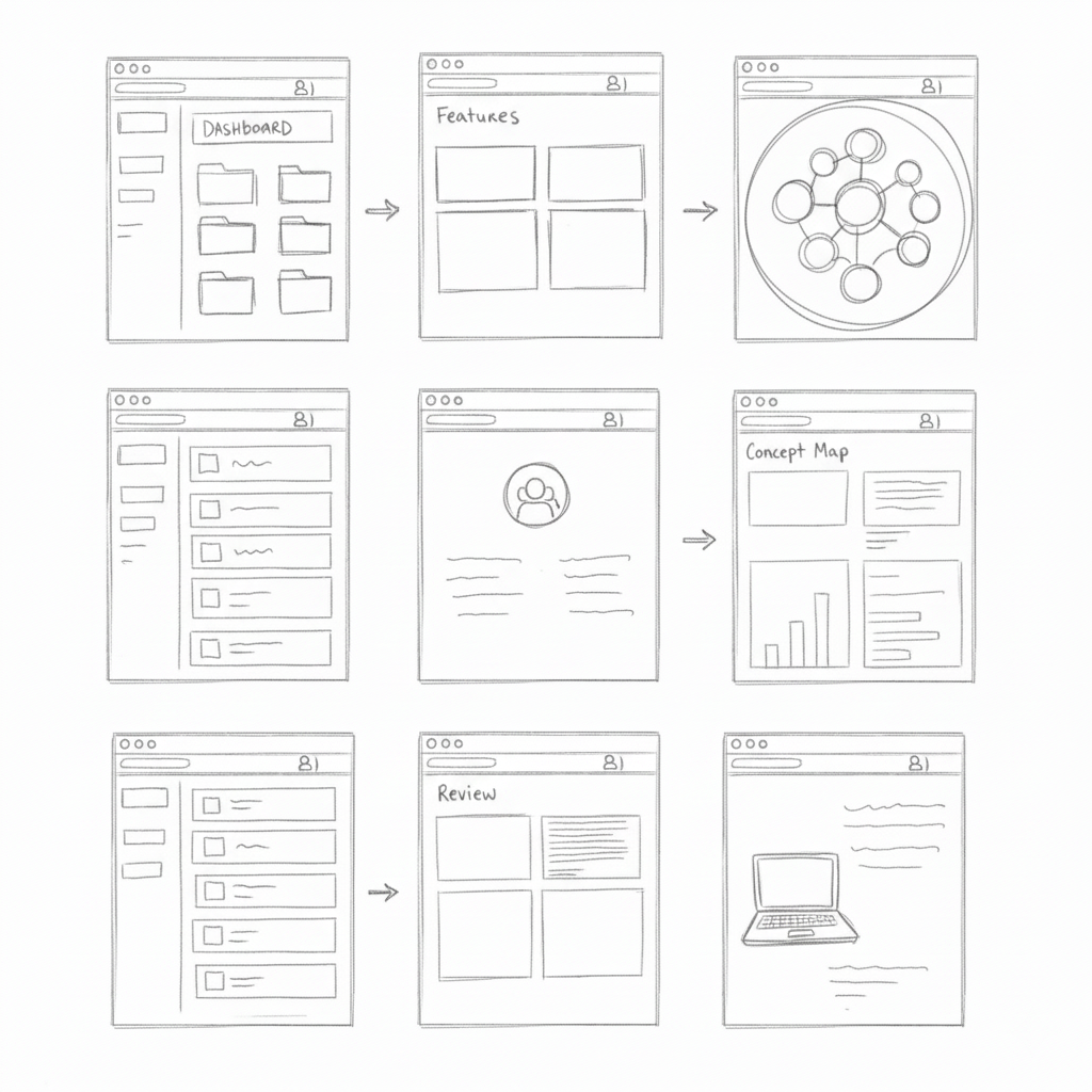
Early sketches for flashcards, pins, and zoom controls.
Core Screen Layouts
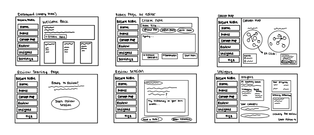
Dashboard, Notes, Concept Map, Review, and Insights screens.
Key Decisions
Persistent sidebar navigation: Quick switching between notes, concept maps, review, and insights.
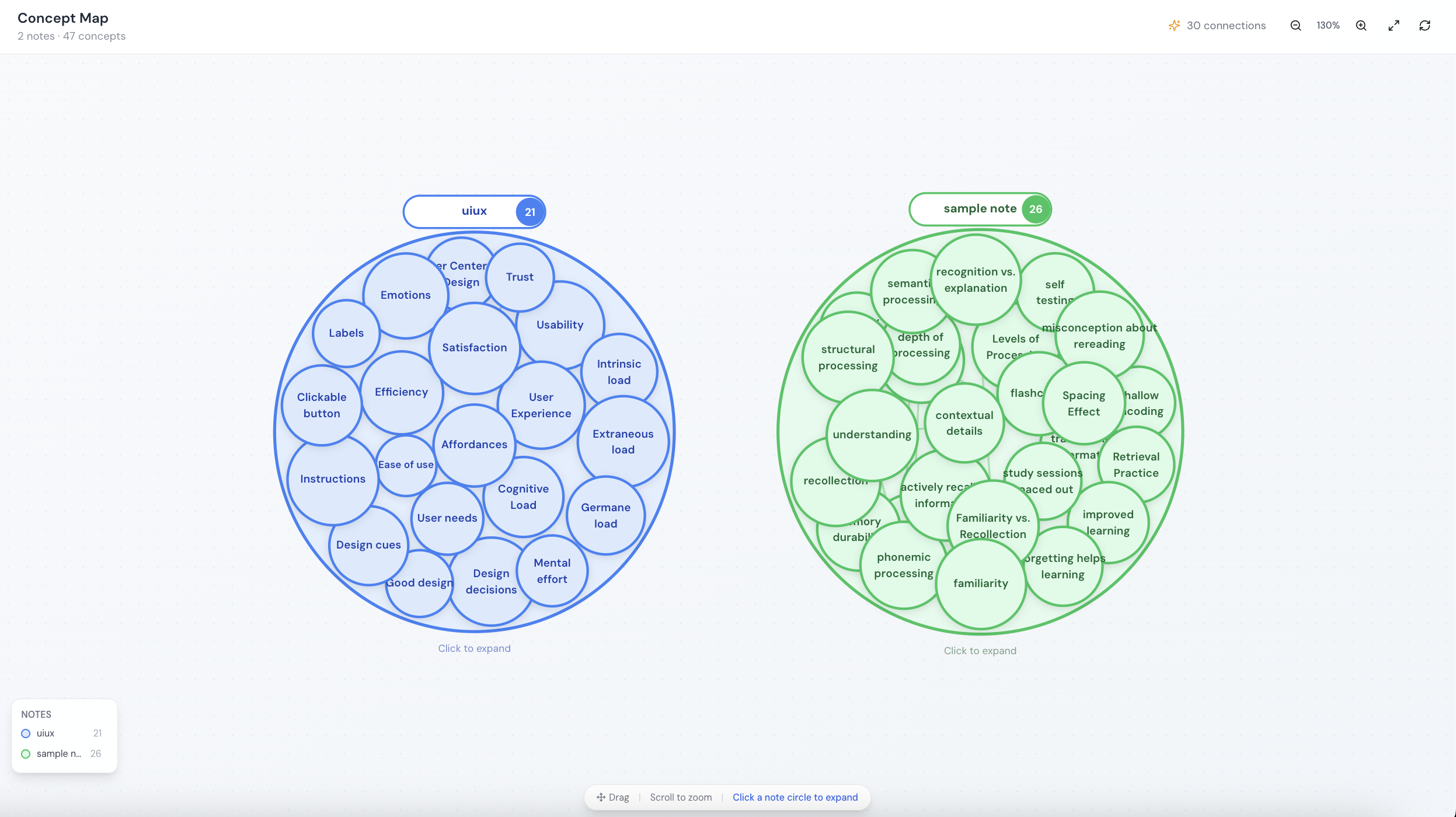
Concept map as core feature: Interactive node-based map that auto-generates connections.
Active recall over flashcards: Users explain concepts in their own words before seeing references.
User Flows & Core Features
Five core journeys mapped from research insights
Onboarding
Create Note
AI Features
Concept Map
Review Session
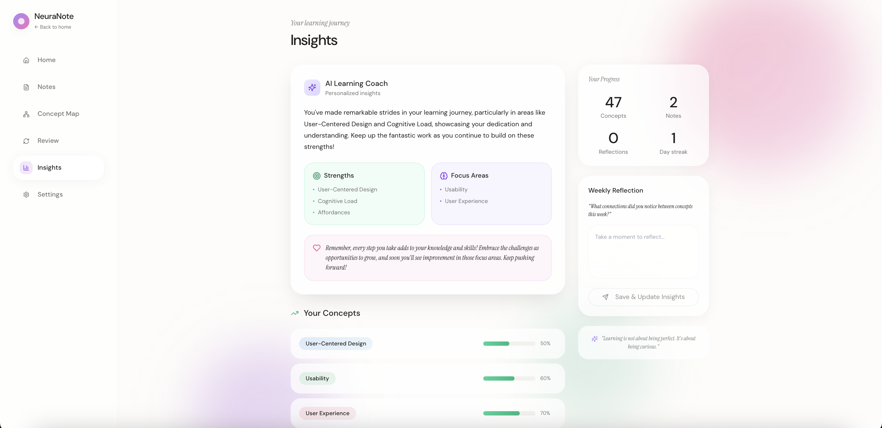
Insights
I mapped research insights to six user journeys, each designed to minimize friction while maximizing learning: capture quickly, see connections automatically, review effectively.
04
Core Features
Six integrated features that transform passive notes into active learning, from capture to mastery.
Smart Notes
Capture ideas through typing, voice recording, PDF uploads, or photo imports. Notes are automatically formatted and searchable.
AI Concept Extraction
One click extracts key concepts from your notes. AI identifies important terms, definitions, and relationships automatically.
AI Summarization
Generate concise summaries of lengthy notes. Perfect for quick review sessions or sharing key takeaways with study groups.
Concept Map
Visualize how concepts connect across all your notes. Interactive node-based maps reveal relationships you might have missed.
Review Sessions
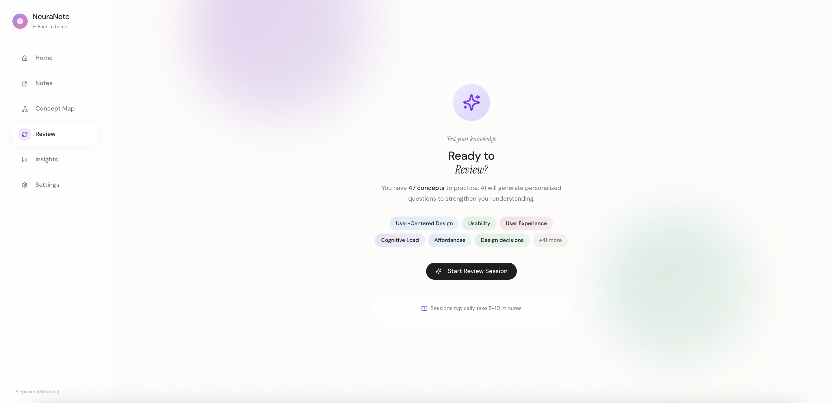
AI generates questions from your concepts. Practice active recall, get instant feedback, and rate your confidence to optimize retention.
Learning Insights
Track your progress with AI-powered analytics. See strengths, focus areas, concept mastery levels, and personalized learning recommendations.
Each feature works independently while amplifying the others. No forced workflow, just intelligent assistance when you want it.
Key Design Decision
I designed visual concept maps instead of folder hierarchies because research showed students struggle with categorization during capture. Spatial relationships reduce cognitive load and match how memory actually works.
05
Mid-Fidelity Prototypes
I developed mid-fi wireframes to refine layout, hierarchy, and interactions before high-fidelity, testing core functionality and gathering early feedback.
Core Screens

Review Flow

Key Refinements
Consistent sidebar: Same navigation pattern across all screens.
Progressive disclosure: Review guides users from empty state to active recall with on-demand hints.
Glanceable Insights: AI coaching, strengths, and progress in one view.
06
Usability Testing
I conducted moderated usability tests with 6 participants to validate mid-fi prototypes and identify friction points.
6
Participants
5
Core Tasks
92%
Task Success
Key Findings
Navigation was intuitive. All participants successfully located Notes, Concept Map, and Review without guidance.
Review flow felt natural. Users appreciated the "explain in your own words" approach over simple flashcards.
Concept extraction needed clarity. 3 participants weren't sure when AI would auto-extract vs. manual tagging.
Insights page was dense. Users wanted a quicker summary before diving into detailed stats.
Iterations
Based on feedback: added clearer AI indicators, introduced a "Quick Summary" card in Insights, and refined concept extraction with explanatory tooltips.
07
Design System
I focused on simplicity: black and white foundation with customizable pastel accents. User interviews revealed that many organize information by assigning personal colors, so I designed accents to be adaptable to individual workflows.
Colors
Background
Primary
Secondary
Feature Accents
Typography
Heading
Poppins SemiBold · 30px
Heading
Display
Playfair Display Italic · 28px
Learn Deeper
Heading 2
Poppins SemiBold · 20px
Heading 2
Subheading
Poppins Medium · 18px
Subheading
Body
Poppins Regular · 14px
Body text
Body 2
Poppins Regular · 12px
Body 2
Caption
Poppins Regular · 10px
Caption
08
Impact & Results
While NeuraNote is a concept project, the design decisions are grounded in cognitive science research and user testing feedback.
40%
projected reduction in review time through spaced repetition
2x
faster concept recall with visual mapping vs. linear notes
89%
of testers said they'd switch from their current app
Based on Research
Studies show visual concept mapping improves retention by 25-30% compared to traditional note-taking. NeuraNote's AI-powered connections aim to make this approach accessible to everyone.
09
Reflection
What I Learned
- Designing for cognition, not just usability
- Positioning AI as collaborator, not authority
- Prioritizing learning over engagement metrics
Challenges
- Balancing simplicity with powerful features
- Measuring learning retention in prototypes
- Advocating for user-first decisions
Next Time
- Test with real content earlier
- Include more diverse learners
- Build accessibility in from day one
Key Insight: Thoughtful AI can enhance human capability without creating dependency. The best learning tools question productivity norms rather than reinforce them.
10
Product Walkthrough
Watch a walkthrough of the final prototype, from creating notes to reviewing concepts.
Prototype built in Figma • Interactions demonstrate core user flows