Customer problem
Founders and consultants had expertise worth sharing, but turning it into consistent content required time, writing confidence, or agency support.
UI/UX Design Internship · March–May 2026
ToniPR is an AI-assisted interview product that turns one short conversation into reusable marketing content. I designed the complete customer journey, from discovering the product to reviewing finished work.
The people ToniPR serves already know their work. The difficult part is extracting the strongest ideas, shaping them into a story, and adapting that story for every place they need to publish.
A generic AI writing tool still asks them to structure the prompt and judge disconnected drafts. ToniPR needed to do that work through conversation while keeping the user's voice and source material visible.
Founders and consultants had expertise worth sharing, but turning it into consistent content required time, writing confidence, or agency support.
ToniPR replaces the blank prompt with a guided interview, then turns the conversation into source-backed posts, articles, quotes, and video clips.
I designed the service journey, public website, pricing, authentication, onboarding, interview setup, dashboard, conversation states, output system, and responsive behavior.
The AI should feel like a prepared interviewer; the user should remain the author.
I mapped the questions a user carries from the first landing-page visit through the moment they publish. This kept the public site and signed-in product aligned around one promise instead of feeling like separate experiences.
Can this solve my visibility problem?
Lead with a concrete content-kit outcome.
Is this worth my time and money?
Make scope, pricing, and proof easy to compare.
What will I need to do?
Set expectations before camera and microphone access.
Am I answering this well?
Use one clear prompt, progress, and calm feedback.
What can I use right now?
Organize one conversation into channel-ready outputs.
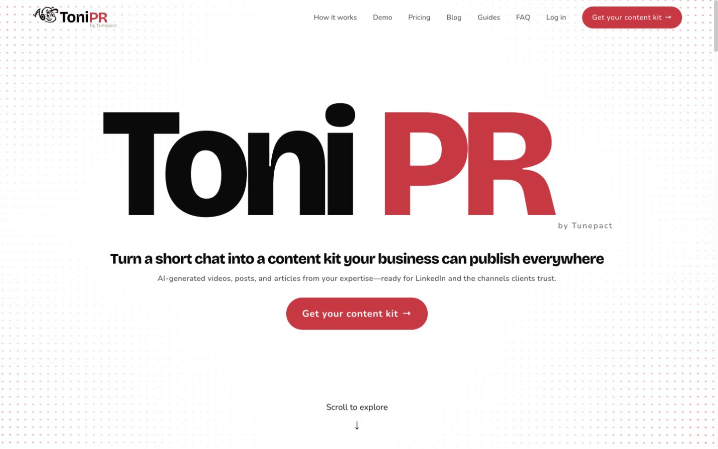
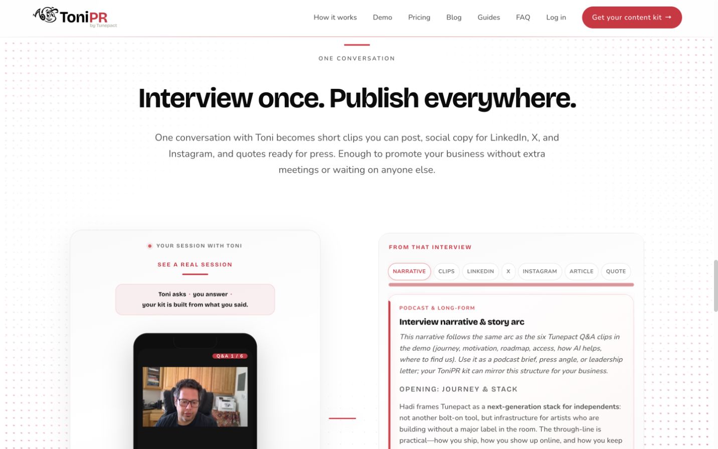
The marketing experience follows the same mental model as the product: choose a goal, talk naturally, and receive a kit. Proof appears before purchase through a real interview and visible output formats.
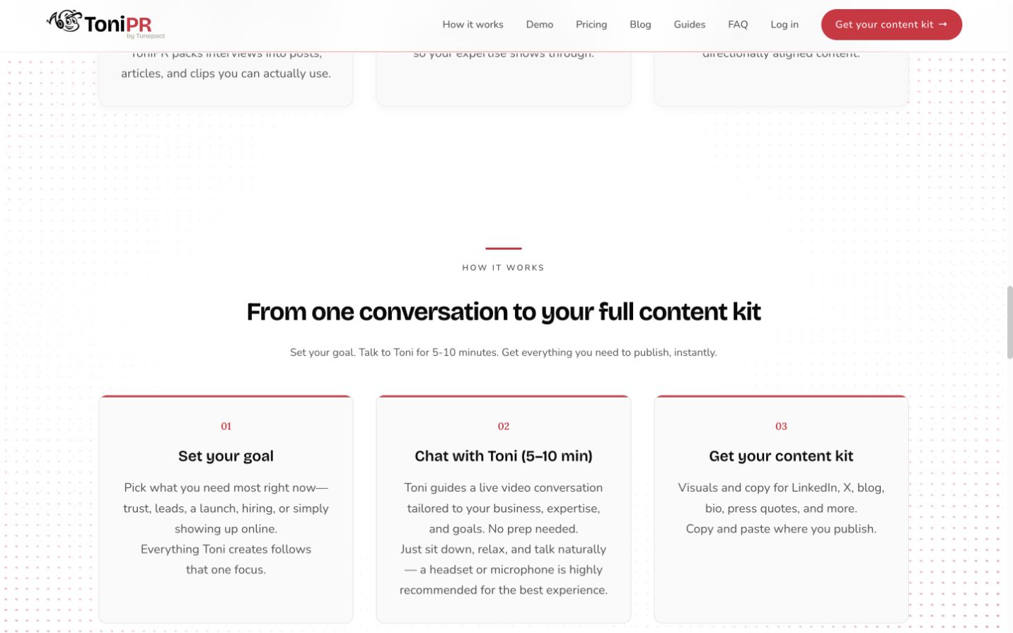
“Content kit” gives the experience a memorable container and makes the output feel finite.
“5–10 minutes” helps users decide whether they are ready before entering the flow.
A real interview beside its results demonstrates where the AI output came from.
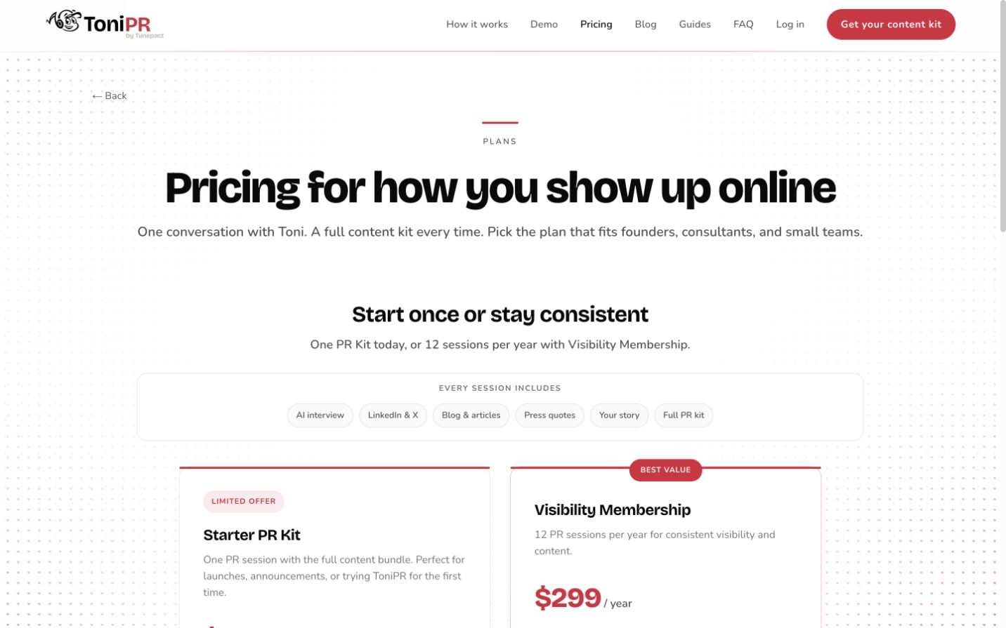
I designed pricing, educational content, customer stories, guides, and FAQ pathways around the decisions a prospective customer makes: Is this for me? What will I receive? How much effort will it take? What happens to my content?
The signed-in journey carries the same language and visual tone into account entry, goal selection, preparation, and the live session. The system provides structure without taking attention away from the person speaking.
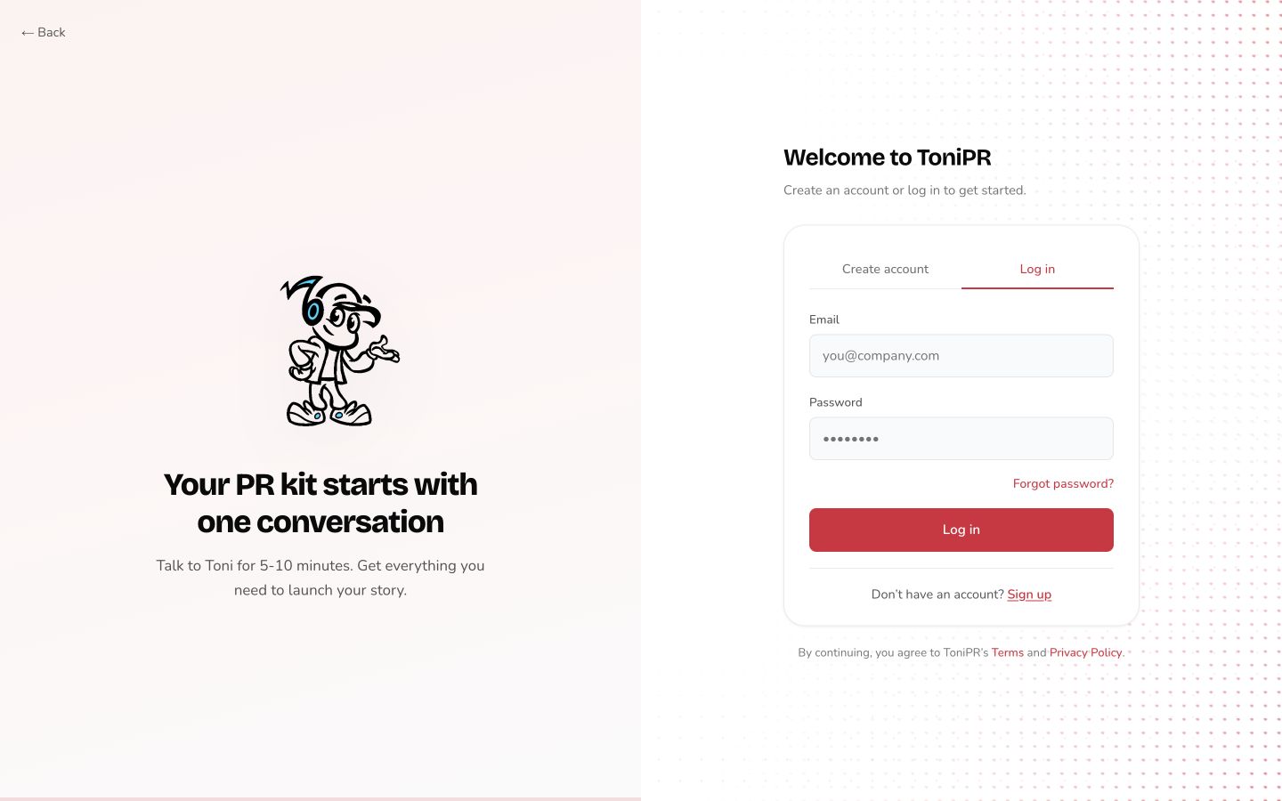
Continuity across the handoff
The split layout pairs a focused form with Toni and one concise benefit statement. That balance maintains personality while keeping the task, validation, and recovery paths straightforward.
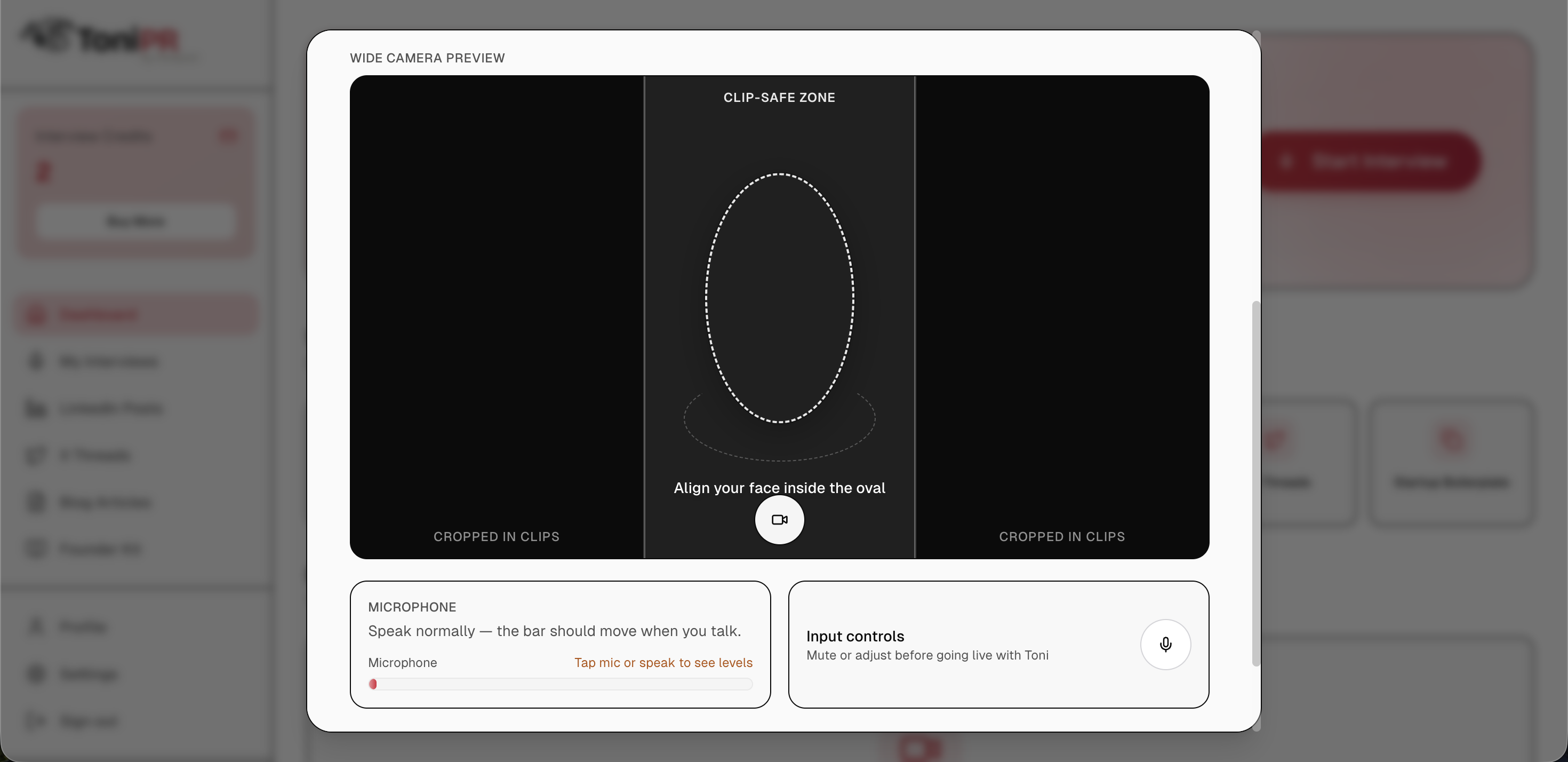
The dashboard makes the value of an interview visible immediately. A six-step setup then narrows the goal, point of view, voice, and recording conditions so the session feels prepared without requiring users to write a brief.
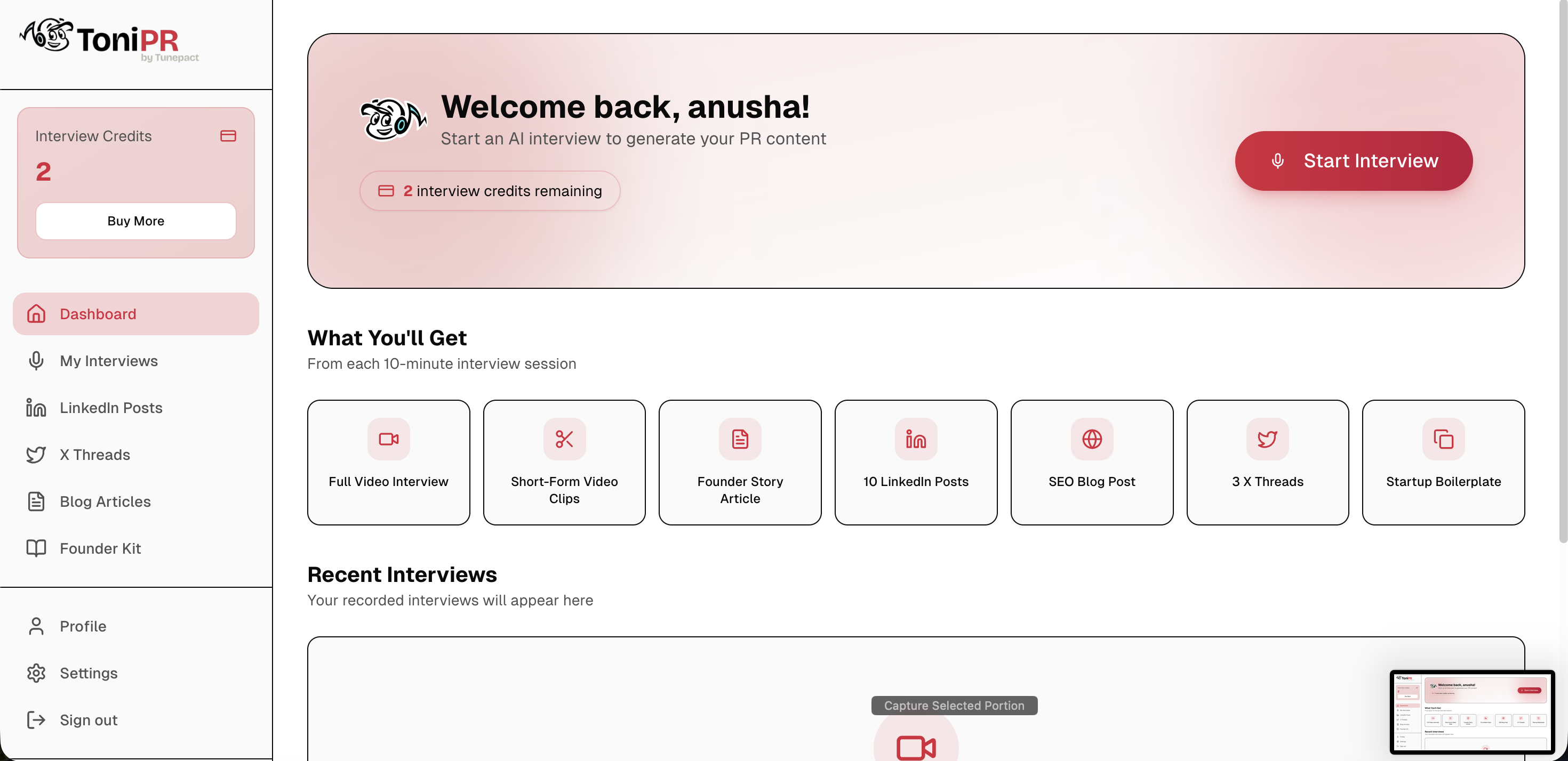
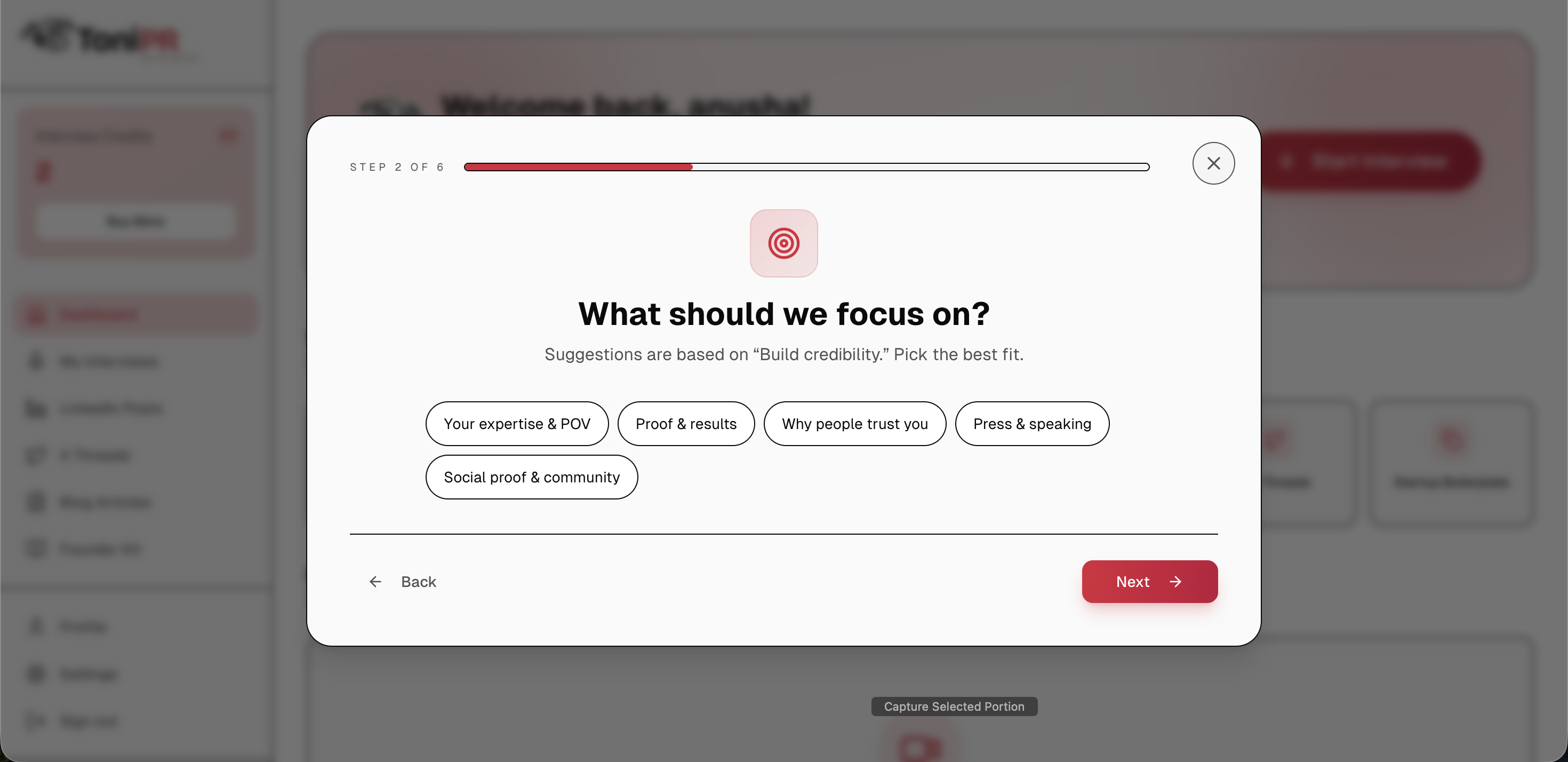
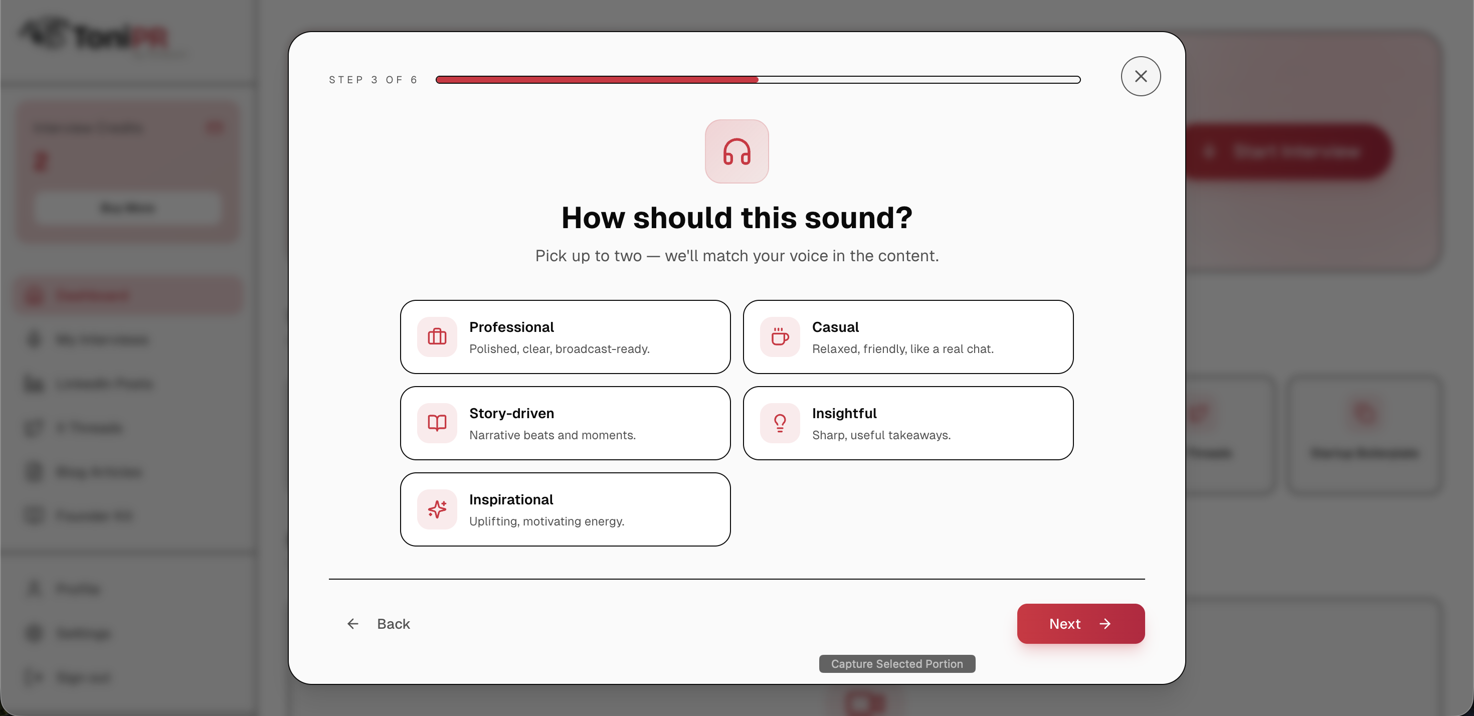
Start with the outcome the user needs: trust, a launch, leads, hiring, or consistent visibility.
Explain that the session is short, conversational, and does not require prepared copy.
Keep the current prompt and response state dominant so the interface never competes with the conversation.
Pair progress, recording feedback, and completion cues so users always know what is happening next.
Permission denied Explain why access matters and give a direct retry path.
Connection interrupted Preserve progress and make recovery feel safe.
Answer needs depth Use an encouraging follow-up instead of an error state.
Generation takes time Show active progress and set a clear expectation.
The content experience does more than list generated copy. It preserves the relationship between the original answer, the larger story, and each publishable format so users can review the work with confidence.
Voice, expertise, examples, and language from the user.
Themes organized into a clear narrative with supporting evidence.
Length, framing, and tone shaped for where the content will live.
A usable next step instead of a wall of generated text.
I owned the visual and interaction design across the public website and signed-in product. One shared journey kept product behavior, content, brand expression, and implementation details aligned as the experience evolved.
Defined the promise and the questions a founder needs answered at each stage.
Connected marketing, account entry, interview, generation, and publishing in one service journey.
Explored hierarchy, conversation pacing, Toni’s states, and output organization.
Used flows and annotated screens to make product logic, copy, and edge states reviewable.
Tightened responsive behavior and visual consistency across public and signed-in surfaces.
The work helped move ToniPR from a product idea into a live, purchasable service with one coherent path for attracting, onboarding, interviewing, and delivering work to new customers.
After launch, the product began attracting new sign-ups. I framed success across the complete funnel: acquisition, account creation, interview completion, and delivery of a finished content kit.
Estimated early-stage impact based on current traction; replace with verified post-launch analytics when available.
Reflection
Trust grows when people can see how their own input shaped the AI result.
A character adds warmth, but pacing and feedback make the conversation usable.
The strongest onboarding begins before sign-up, with a promise the product can keep.